Tuesday, June 2, 2015

Art Three Final Blog Dawg

Piece Numero Uno:

The first piece of artwork that I think shows a lot of what my style is, is my "cheeky" piece. Here are a couple of pictures..


The first 'artistic behavior' I chose for myself is, "I Create Original Art." To answer the first question, I believe that I incorporated my own unique ideas into my work through the use of texture and bold colors. One of my absolutely favorite things in the art world is the ability to create texture through various different mediums. Mr. Sands helped provide many of the materials needed in order for me to have the bumpy texture you can see above and he also was very supportive and helpful without distorting my own view of what I wanted. To answer the second question, I didn't really have much inspiration despite the want of texture and bright colors. As bad as it may sound, this project sort of just came to be as I worked on it. All my original plans and thoughts were thrown out the window with each passing day because I would randomly get an idea or desire to change the direction it was going. The second 'artistic behavior' I choose is, "I Communicate Through My Work." This piece of artwork was originally intended to show that any body size is beautiful, but as it started to turn more abstract instead of realistic, the meaning is more of, the human body is not something to be ashamed of. As one of the issues I faced, I can not begin to describe how many people questioned me for doing butt cheeks and how many people thought it was inappropriate to show such "nudity." It was honestly a bit ridiculous. Human anatomy is not something to be shamed!!!! It should be shown off and people should be proud of their own beautiful body!!! This artwork is about who I am and what I believe because I genuinely think that any one should be able to show off their body in any way they want. I also believe that everything is beautiful and should be allowed to have art created on it, without having many judge and question it. 

Piece Numero Dos:


 For my second piece of art work, I chose this...ceiling tile replacement thing..? The first artistic behavior I demonstrated while working on this piece is, "I Developed My Art Making Skills." During this project I experimented with many different materials. I used canvas, gesso, white paint, paper mache powder (?), glue sticks, ink, and a spray bottle. I believe that I gained a lot of skill with using these different materials. I used them in a very abnormal way and I think this helped push my creativity farther and developed not only my hand working skills but my thinking/brainstorming skills. My second artistic behavior is, "I Take Risks." I was unsure of this entire project. I felt as if I never knew what my next step was going to be. I tried many different materials and techniques in order to complete this project. 

Piece numero tres:
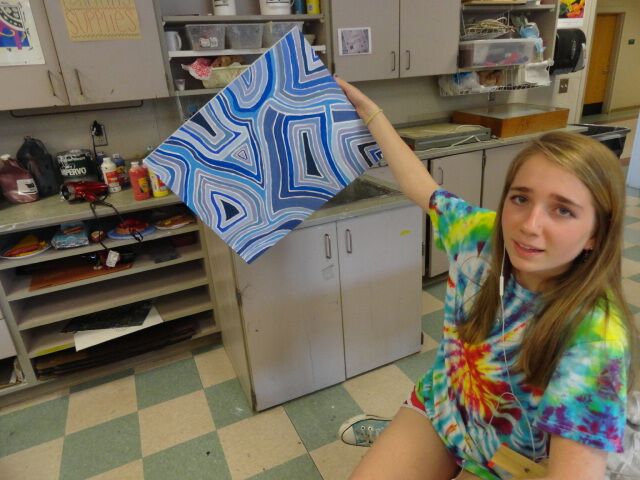


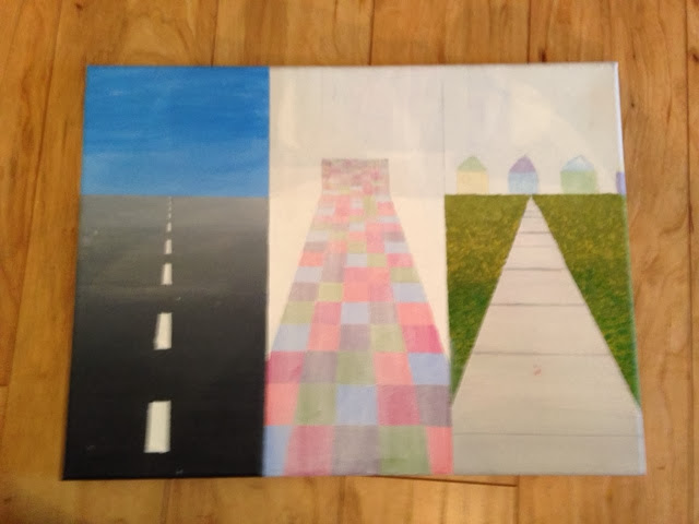
If i were to redo one project, I would most likely choose this abstract-esque acrylic painting. I don't not like it, but I did not really plan anything about it out, I kinda just put the paint wherever. If I were to redo it, I think I would make it more complex, and change the shapes up more. 


Monday, May 11, 2015

Weird Abstract-Like Series

So..I don't really know how I came upon doing this. I was working on another project (which i grew frustrated with very quickly) and decided to take a break day and just paint some random stuff on one of the used canvases we've got lying around the art room. That was this.
It's hard to see from far away, but the lines with white and blue going through the whole thing were my absolute favorite part of this piece and i wanted to do something more with those colors..so I did. I made another piece following virtually the same shape-idea as this one but kept a more monochromatic color scheme. That was this guy.
I really really love the colors in this and am very happy with the way it turned out. I kept this project at school to work on but one afternoon i was sick of being inside watching tv, so i went outside with my paint and made another one of these. I don't know why i made so many similar things but i really like them so whateeeeever. The one i made at home is this.


Friday, March 20, 2015

C H E E K Y PART DOS

So... I haven't blogged in a while. I have officially started acrylic painting the butts. I have gone through many different stages during this project but alas I have come to a conclusion (I think) on what I'm doing. I started off with Mr. Sands helping me make a large canvas (thx buddy) and then I began the painting process. I looooove getting messy so I decided I wanted to finger paint. I also love texture so I wanted that chunky paint look. After getting through the background I outlined the butts. After that I decided i kind've wanted the figures to be raised? just higher up off of the background. Mr. Sand's awesome self suggested that I use cotton balls and gesso to get a bigger, thicker texture, so I did. Then began the painting process....which is taking me quite a while and you can see my progress below. I think that's all I'm going to say for now. Displaying IMG_0261.JPG
Displaying IMG_0355.JPG
Displaying IMG_0377.JPG
Displaying IMG_0459.JPG

Sunday, February 8, 2015

C H E E K Y

For the dig deeper part of this project, I decided to use my Pinterest to look for inspiration and ideas... Here's the link : https://www.pinterest.com/emmadosa/art-three-text-art/

For the first part of the challenges, I did a black out poem from the book "Night" by Elie Wiesel. I didn't really make it into a poem, I kind've just kept all the adjectives..which ended up being very sad.
For the second part of the challenges, I decided to do the word "hot," but with flames and the like.... I didn't really like the way I started with pencil and having the colors so seperated. So I started over and did this. 
...Which I really don't like any better but hey, what can ya do?

I have spent a lot of time thinking on what I would like to do for my final project.. I had no inspiration and honestly no interest in anything until Kirk and Mersina were joking around and Kirk said I could do two peoples butts and spell out "butt" ..... I really really liked this idea, so I decided to run with it. I changed it up a little bit though. So instead of doing the word "butt" written across, im going to do the word "cheeky." The only problem with this is the fact that id like to use real people but that is supposedly a risky move considering the amount of skin that will be shown. Today, I am going to go ahead and do what I want and take the pictures and tonight I will email/talk to an administrator to see if they'll allow it.  If I get a no... I will be very sad but I suppose I will then have to draw or paint the image I have. 

Sunday, January 12, 2014

3D Questionable


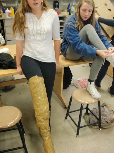
For this project Ashlyn and I decided to make a life size person completely made out of tape. When we started this project it was looking good and normal but somehow it turned out looking disfigured and to be honest, scary. I don't like this piece at all but it was fun and a learning experience creating it.

sticky situation


First of all, if you'd really like to hear a sticky situation..keep reading. After I finished this project my sister saw and she really liked it so I gave it to her, but just now am I realizing that I don't have a picture of the final product so I can't even show what it turned out like so for that I'm sorry. For the brainstorming of sticky situation I immediately thought of gum because I've run into many problems involving gum so it related to me, and the repetition was the various places I remember stepping in gum and having it stick to my shoe. I decided to use acrylic paint because I am familiar with it and enjoy working with it. One of the struggles I ran into was the floor of a super market and how to get the tiles right, I'm sure I redid that part about three or four times, it got so frustrating. I don't think the mini lessons we were taught really helped me that much when completing my piece because I didn't need any of the different techniques to accomplish what I wanted. 

portraits using non art supplies


I chose to do Scott Avett for my portrait because he's in my absolute all time favorite band that's I've loved since a child, and also because he has a beard and I love beards. When I was brainstorming what to use as my materials for this project I was pretty clueless and really could only think of skittles for a while, but I wanted it to be black and white and not be edible (because I have dogs and don't want them getting into it) so i just opted out for push pins, it really just came to me. This material impacted my project because the only colors I could find it these pushpins were black and white so they completed what I intended this project to look like. Some of the challenges I faced were needing so many pushpins..these things were pretty dang expensive so my parents were getting a little iffy by the third time we had to go out and get more. and also I needed way more black pushpins than white so I had to spray paint some white ones black and use gel medium to give them a glossy finish. The pushpins and Scott really have nothing in common, so pushpins necessarily weren't that important to me as I could have used any other material. 

Friday, January 10, 2014

texture/pressure

I took pressure and texture literally, and figuratively. It has texture by all the different parts of the pizza, and it shows pressure by it being and actual pizza symbolizing the way society tries to shape us into thinking thin and skinny is perfect. it's been a struggle for me in the past and I guess pizza doesn't really exactly show what I mean as much as food in general does. When I started this project i had no idea what I wanted to do, all I knew was I love pizza so much I wanted to do a project based off of it. I think I really got the way crust looks done well, I'm pretty happy with it. If there was one thing I'd like to change about this piece. it would probably be the cheese I really didn't know how to make it looks that realistic and also have a lot of texture.

Tuesday, January 7, 2014

Marble Drop


On this marble drop, I worked with Ashley and Lizzie. Our theme was 'Winter Wonderland.' We came up with this ideas kind've randomly after just brainstorming for a bit. The thing that was most difficult for me was trying to get the snowman to sit right so when we dropped a marble through it would fall into the right spot. The marble travels in sort of a zigzag shape and we just used some small pieces and hot glued them together. If there was one thing we could change about our marble drop, I think I would choose to change how the zigzags go because I feel like they're too steep and didn't work as well. I think I'm most proud of the background, I just think it looks really good and well put together

repetition


For this piece, I decided to work with clay..again (haha big surprise.) I took the word repetition by creating multiple lines around the outside to add texture as well.When we first got this assignment, I knew I wanted to use the potters wheel since I had yet to use one. After I had created my bowl, I was planning on doing little dancing bears around the perimeter of the top but the size I wanted them was really difficult for me to trace and carve it out so I ditched that idea. As I was trimming my bowl, I kind've just went with the flow and started creating uneven lines to the outside, it was really just a 'spur of the moment' kind of thing. One thing I think I did successfully was just the bowl itself, for one of my first bowls ever I was really proud of how it turned out. One thing I would like to change about my piece is the size, I wish I had made it bigger so I could use it for more things.

Monday, November 4, 2013

Relief Piece


Three forms of relief artwork are high relief, low relief, and sunken relief. High relief is when forms from the background come forwards to almost half their depth. Low relief is when forms from the background only come forward a little bit. Sunken relief is when you carve into the medium instead of adding to it, so therefore creating the sunken in effect. I chose to use clay as my medium just because I really love working with clay and I thought it would achieve the final product i wanted the best. After my clay piece came out of the kiln I wasn't sure whether I wanted to use glaxe or paint but since I used paint on my vessel project I decided to just switch it up.I think the thing I'm most proud of is the center and the texture it has there. One thing I would change is to make sure and be absoultely positive I have it centered and even.

Sunday, November 3, 2013

Nature Art

Link to pinterest: 
http://www.pinterest.com/emmadosa/nature-art/

 Nature art, means exactly what its called, a form of art using things you find out in nature. You create something out of what you kind find in the environment you are and then just leave it and let it go, it's temporary. I got the idea for my project because i kind of wanted to created a flower or "plant," using other flowers and plants. the first picture (above) is everything i just found in my backyard, and the one below is after i added some white paint just to add some detail. I wish I would've realized before I plucked the flower that I could've found one laying around that was already disconnected so I didnt have to kill it, so next time that thought will definitely be in the back of my mind.

Wednesday, October 2, 2013

Up Close And Personal


When given the theme, "Up Close And Personal," I had multiple ideas that I thought would be really cool. I was thinking maybe a drawing of my ipod with my favorite bands or a pair of eyes, one with makeup and one without. But everytime I tried to follow through with these ideas I didn't like the way it looked, so I resorted to doodling in my sketchbook one period and was messing around with the pastels and a tortillon to blend stuff out. And a bunch of people told me it looked really cool and Mr. Sands helped come up with the idea to do feathers. To be honest, I haven't ever really payed attention to feathers but after thinking about them, I realized that they demonstrate up close and personal really well. Every feather off every single animal is different. Not one feather is the same so it makes it personal. I chose to use pastels because they blend really well but also can stand out really well against blank paper.I think the only risk I took was just kind of winging it and hoping my piece turned out okay. I used alot of technique in this because I thought out side of the box when using the tortillon to make the cool feather like design.

Tuesday, September 24, 2013

Art Article : Van Gogh painting discovered


September 23, 2013

Period 4


After reading this article, I was really interested in finding out what happens when people mistake

art for fakes, like with what happened to Van Goghs' in 1908. I researched about who is responsible for

 mistakes and forgeries like this, the buyers or the sellers? In my opinion I would not say it is anyones 

fault, how can one be so sure of whether something is real or fake. In the article I read, it talks about 

how accountability matters. Say you were looking to buy a pair of shoes from someone, you would 

want to know what kind of environment they've been in, how many times they've been worn, who was

 wearing them, and things like that. It's the same with art and other collectable things. 


It is also said that when looking to buy something that could be fake, always set up a time where 

you can inspect the item and make sure that it is what you want. Anything the seller says could be a lie, 

or a scam, you just have to be careful enough to check things out yourself and use your research and 

background information to see whether it’s a fake or not.


article used:

http://spaceloa.com/blog/2013/05/how-responsible-are-buyers-of-fakes-and.html  

Sunday, September 15, 2013

What's The Point?


I decided to work with charcoal as my medium because I really like how easy it is to make highlights and shadows and how easy charcoal blends. Charcoal helped me make my drawing stand out more against the paper so it looked more life like, which is something I wanted. I mostly used shading and highlighting in this piece because I wanted the tusks to stand out a lot especially the broken tusk, which leads to the main reason I decided to do an elephant. When I first heard, "What's The Point," I immediately thought of things like polluting the environment and harming animals. So it was pretty easy to make it happen because firstly elephants are my favorite animals and secondly it was easy to show by having one of the elephants tusks broken, because elephants are very much so endangered by being hunted for their ivory tusks. Elephants can not survive when their tusks are completely removed.